How fonts are fueling the culture wars

Ben Hersh writes for BackChannel:
Typography is undergoing a public renaissance. Typography usually strives to be invisible, but recently it’s become a mark of sophistication for readers to notice it and have an opinion.
Suddenly, people outside of the design profession seem to care about its many intricacies. Usually, this awareness focuses on execution. This year’s Oscars put visual hierarchy on the map. XKCD readers will never miss an opportunity to point out bad keming. And anyone on the internet can tell you, Comic Sans has become a joke.
But by focusing on the smaller gaffes, we’re missing the big picture. Typography is much bigger than a “gotcha” moment for the visually challenged. Typography can silently influence: It can signify dangerous ideas, normalize dictatorships, and sever broken nations. In some cases it may be a matter of life and death. And it can do this as powerfully as the words it depicts.


You probably know blackletter as the script of choice for bad guys, prison tattoos, and black metal album art—and you wouldn’t be wrong.
Blackletter looks esoteric and illegible now, but it started off as a normal pattern that people across Europe used every day for hundreds of years. It stayed that way until pretty recently. It reigned as the dominant typeface in the English-speaking world for several generations, and remains popular in parts of the Spanish-speaking world today.
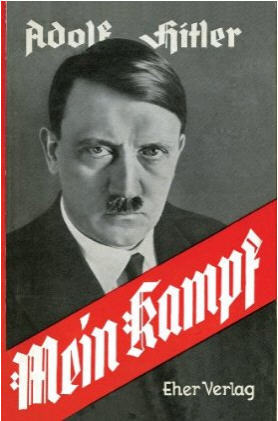
Why don’t we use blackletter anymore? The answer is literally “Hitler.” Nazi leadership used Fraktur, an archetypal variety of blackletter, as their official typeface. They positioned it as a symbol of German national identity and denounced papers that printed with anything else.

As you might imagine, the typeface hasn’t aged well in the post-war period. In just a few years, blackletter went from ordinary to a widespread taboo—the same way the name “Adolf” and the toothbrush mustache have been all but eradicated.
[Read Up]
Comments
Post a Comment